[RU]
О проекте
«Родина» – это молодая компания, которая занимается продажей стройматериалов.
Большой ассортимент экологичных материалов.
Большой ассортимент экологичных материалов.
Целевая аудитория – люди, чей доход ниже среднего и средний.
Важно показать надёжность, развитие и экологичность.
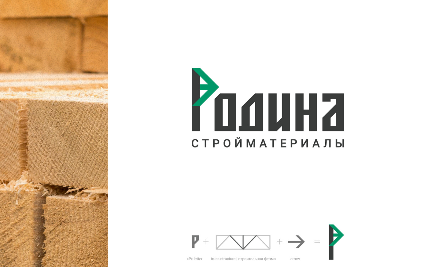
Решение
Логотип разработан на основе шрифта.
Шрифт подобран строгий, монументальный, отражающий надежность компании.
В букве «Р» присутствует геометрическая фигура стрелка, что отсылает к развитию
и движению вперед. Также данный символ напоминает часть строительной фермы.
[EN]
About
"Rodina" (en=Homeland) is a young company that sells building materials.
Large range of environmentally friendly materials. The target audience - people whose
Large range of environmentally friendly materials. The target audience - people whose
income is below average and average. It is important to show reliability, development
and environmental friendliness.
Solution
Logo was designed based on the font.
Font was chosen strict, monumental, reflecting the reliability of the company.
There is an arrow geometrical figure in "P", which refers to the development and moving forward.
This symbol also resembles a part of the truss structure.